Wednesday, December 23, 2020

Data Visualization in an EPM World - Part 2 - Setting Filters and Creating a Template

In my first post in my series Data Visualization in an EPM World; I showed how to connect and explore the dimensions within DV.  This post will show some of the nuances of filters and setting up the canvas Point of View (POV)

When creating a DV Project from an EPM data source you need to bring all the dimensions to the filters and set some value or All for top member depending on the type of Visualization is being created.

First I will start with the Account Dimension.  I will use Account Default for the default alias and because it has all the members in the dimension and set the filter to 40000-Revenues.

Next, I will bring in the Cost Center Default


Notice that the values do not show up.  This is default setting for the filter to Limit what is shown based on other filters.  In a future release this default will be able to be changed.  In the meantime place cursor just the right of the filter name and a small downward triangle will appear, click on Limit Values By and select None.


 Now you will see values for Cost Center.  If no values are select the filter assumes All.


Set all the remaining dimensions to the filter bar and set values where needed.  For the purpose of my visual a Performance Tile the dimensions Years, Period, Currency, Scenario and Version each needs to be set to a specific member.


The tedious part of setting the Filter POV is changing the Limit Values By setting on each filter.  That is why I recommend setting up the POV and then saving the file as a template to save time on future projects and then when in a project duplicate the canvas.

One thing to note, each visualization has a filter, so a dimension can be removed from the global filter and used in the visualization filter.


The only limitation with the visualization filter is that you do not have same Limit Values By option.


So with a bit of work you can quickly get a base DV Project using EPM Data.


My next post will look at other visualization that work well with EPM data and I will explore some calculated fields that can help better tell the data story.


Monday, November 30, 2020

I Learned Something New - Dashboard Prompts on Embedded DV Project

It is fun when I learn something from one of my clients.

Prompts within a DV Project is currently limited to the Listbox.  But what if you would like to use the other Prompt types that are available within Analysis and Dashboards?  The simple answer...embed the DV Project on a Dashboard and use Dashboard Prompts.

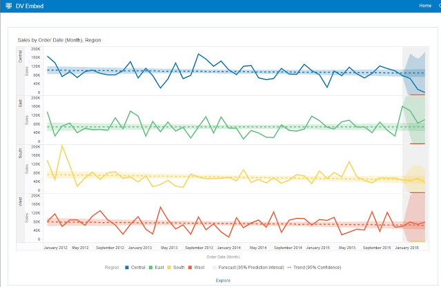
Below is a simple project that forecasts sales and is filtered to Customer Segment.  

This post will show how to use Dashboard Prompts with a DV Project.


Create a Dashboard and embed the DV Project

 
Note that the Filters do not show up in the dashboard view.


Create a Dashboard Prompt from the same Data Set that the DV Project uses. 

 
Pick a column you wish to prompt for.


Select the User Input type and the rest of the prompt properties.

 
For the Check Box values I selected the the Customer Segments over using All Values.  For some reason even though there is a Customer Segment on every row a NULL is available to select.
 

The Preview of the Prompt shows my check boxes for Customer Segment.


Now time to add prompt to Dashboard


Here is the Prompt in action.


It should be noted that the prompt does not require a column be in the project filter.

Friday, October 30, 2020

Data Visualization in an EPM World - Part 1 - Connecting to EPM App

It should not come as a surprise when I say I like Data Visualization and Data Storytelling.

I have worked in Data Analytics for over 20 years and I always strive to find better ways of creating information from data.  Data Visualization and Data Storytelling is powerful way to convey data in way that allows users to gain insight and helps drive action.

Oracle extended connectivity from Oracle Analytics Cloud to Oracle EPM via the OAC Repository (RPD) in the ___ release.  In March of this year I wrote about some modeling considerations when working with EPM in the RPD (see EPBCS and OAC Metadata Issue ).

In the ___ release of Oracle Analytics Cloud Data Visualization (OAC-DV) direct connection to Oracle EPM was made available.  This connection supports EPBCS and FCC.

While connecting to EPM is easy querying from and making visualizations can be a bit of a challenge at first.

It should be noted that a subject area based on EPM within the RPD can be used in OAC-DV, this post will discuss the direct connection from OAC-DV.

In Sept. 2020, Oracle EPM introduced "Dashboards 2.0".  It greatly improved the visual display of EPM Data.


There are numerous reasons and benefits as to why one might want to use OAC-DV on Oracle EPM data.  That discussion is for another day.

I want to talk about the mechanics to connect and display EPM data in OAC-DV.

In the Connection Type interface there is a connection to Oracle EPM Cloud.

The 3 main parameters in the Create Connection window are the URL to EPM Cloud and the credentials.  For now this post will focus on using the shared connection credentials for Authentication, this could be a Service Account.  If there is need for data security the other two options should be explored.

The Connection needs to be saved before you can extend access to other users.

Once saved Click the connection and select Inspect.  On the Access page you can add Users or Roles.  The Password will need to be re-entered before the changes can be saved.


To create a new Data Set select Data Set from Create menu.

Select the EPBCS connection


This will open a list of the Applications/Databases within the EPM Cloud you connected to.  In this case i am connecting to EPBCS with the pre-built modules.  Select the Cube you want to work with and Click Add


Note: For EPM based data sets the data prep stage does not allow for preview or data actions. 

Click Create Project.


Now the fun begins...

Project screen is like all others. The Data Section looks like most other datasets.  As with Essbase the Measure to report on is a single data point and the dimensions make up the intersection to report on.

The Top Data Element Plan1 is where the amount field is found and some of the extra metadata from EPBCS that I will explore in detail in future posts.


When the App metadata is brought into the dataset you will see all the language aliases, you will also have "column" each generation.  Currently there is no way to pick the alias(es) you want in the dataset and there does not appear to be a way to remove them from EPM App.  If you import the EPBCS App into the RPD you could remove all the aliases that you do not need.


The columns to use in a project would typically be the <DIM> Name or <DIM> Name Gen #.


In cases where the hierarchy is ragged (Level 0 is at a different Generation those generation values will be empty.

Some Columns that will make analysis easier are:

<DIM> Name - Has all the members from all levels/generations

<DIM> Parent Key - Helpful for doing working with visualizations that show in Parent/Child

<DIM> Gen Number - Helpful in filtering

<DIM> Leaf Indicator - Helpful in filtering when you may want to show Level 0 members on a ragged hierarchy


Well that is a good start.  One thing to remember is that if you want others to view your projects you need to grant access to the dataset as well.


In my next post I will explore creating a project and the special considerations that need to be taken into account.


Friday, March 6, 2020

EPBCS and OAC Metadata Issue

It has been a while since my last post...a kind of writers block.

This week I have been working on demo content for upcoming webcast on working with EPM Cloud content in OAC DV and BI Dashboards.  And I ran into issues where members in my Account Dimension where not showing up in Analysis or Filters so I thought I would share what I found.

First I had imported my EPBCS app with the pre-built modules into my Physical Layer.


I moved the whole app to the BMM Layer


When I looked at the Business Diagram I see the 9 Cubes

kind of ugly mess...but there are 9 logical stars

To create the Presentation Layer I righted clicked and selected Create Subject Area for Logical Stars and Snowflakes


Voila, I have 9 subject areas.

The work I want to do is with Employ demographics so I will be working with the EPBCS - OEP_REP subject area.  I started working in DV and setting a filter on Account.  I quickly noticed I was not finding the Account I was interested in so I switched to Classic Home and created an analysis with the Account Hierarchy Column.


I am not seeing the Account structure that is what is in REP cube.


So back to the RPD.

This time I brought each cube into the BMM layer individually.


And when I went back to Analysis of the OEP_REP and checked the Account Hierarchy


And it matches the cube.


So something is happening in the RPD when working with multiple cubes in a BMM Layer object.

My recommendation...Import the App and create individual BMM Layer objects per cube.